-
close-->
Stitch UI Design SystemWeb-App, User Experience, Visual Design
A product design system comprised of design patterns, components, and guidelines for creating unified UI in the Stitch product ecosystem.
01Introduction
Stitch UI is a cohesive visual language that offers aesthetic integrity & creates harmonious experiences for users.
Ensure efficient ergonomics and user experiences allowing users to interact with the product in familiar and commonly understood way.
Solve challenging interactions once, and then apply the solutions consistently across our product suite, making sure users only have to learn them once (recognition over recall).
The design language is flexible and will continuouly evolve throughout development, benefiting from research, usability testing, sales initiatives and stakeholders requirements.

02Discovery
Identifying interface problems and inconsistencies: Conducting an Interface Audit.
As a frequent consequence of working in the face-paced, scrappy, agile startup space, the interface had experienced a build up of inconsistent components and patterns over the course of infancy.
Consistency makes users feel comfortable.
03Typography
Proxima Nova
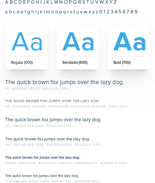
Stitch Labs core brand and product font is Proxima Nova.
Text is the primary way that users digest content and accomplish work, so it’s important to use good typographic principles to establish a clear visual hierarchy and to maximize legibility.
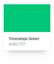
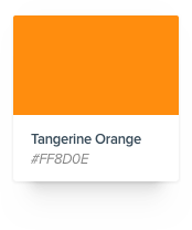
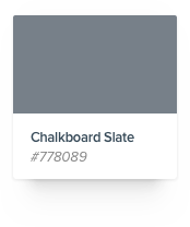
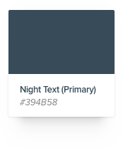
04Color
The Stitch Color Palette
Stitch Labs uses a specific color palette to communicate meaning, convey visual differentiation, and provide a consistent look and feel. From neutrals to brights, each hue is chosen to fit into the overall visual language and promote a contemporary and vibrant user experience.
Color is used sparingly to draw attention to important elements and those that we want the user to take action on. Because most of the application is gray, pops of color catch a user’s eye.

05Form Elements
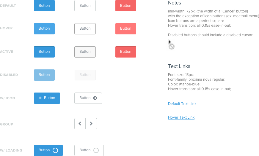
Buttons
Simplified from 40+ different button styles down to 3; Primary, Secondary, and negative action buttons.
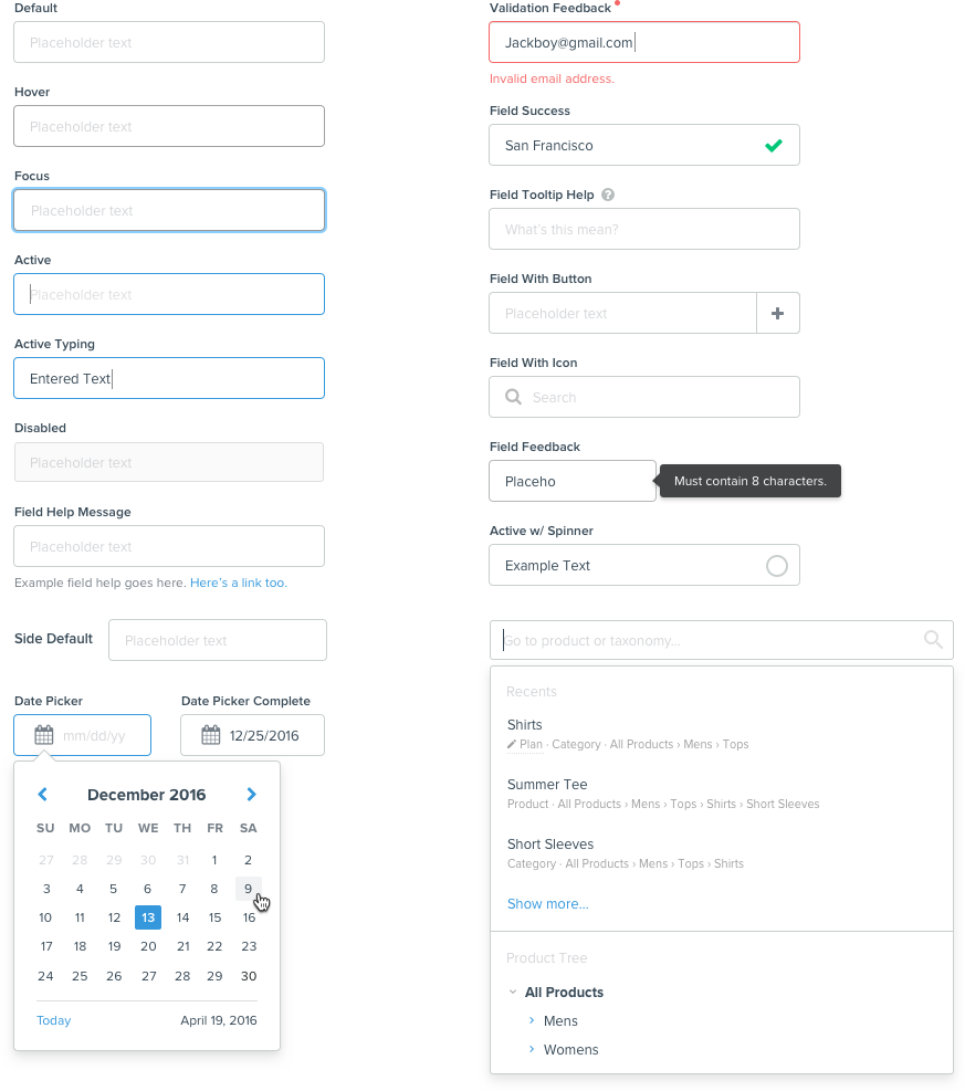
Inputs
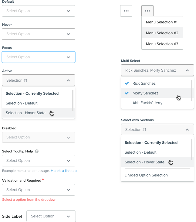
Selects
06User Selection
Checkboxes
Dictates the interaction of option selection from three or more options. Used when there is a list of options and the user may select any number of choices, including zero, one, or several. Use positive wording for checkbox label so it is 100% clear what happens when user checks the box. Use Label tags as click targets for all checkboxes.

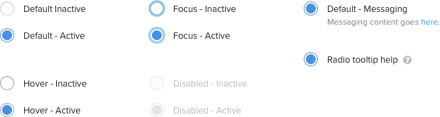
Radios
Used when there is a list of two or more options that are mutually exclusive. User must select exactly one choice. Clicking a non-selected radio button will deselect any previously selected radio buttons.
Toggles and Switches
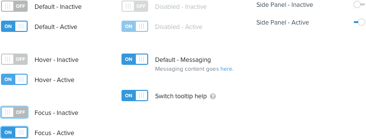
Binary selection. The toggle switch represents a physical switch that allows users to turn things on or off. In general, the toggle is used to represent an action (e.g. start or stop something).
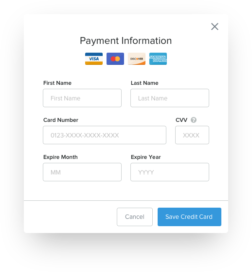
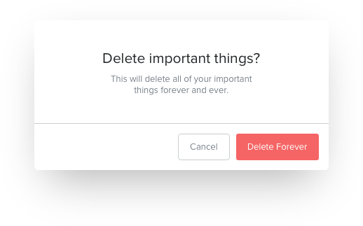
07Dialogs & Modal Overlays
Primary, Large
Simplified from 40+ different button styles down to 3; Primary, Secondary, and negative action buttons.
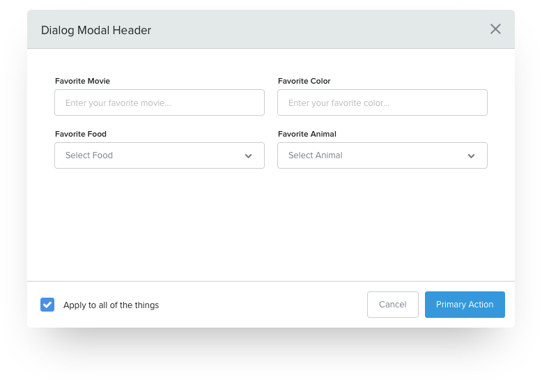
Secondary, Small
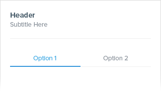
08Tabs
Primary, Sub-navigation
Used as the core style for sub navigation and all tabbed navigation. Consistently found in all high-level detail views throughout the Stitch product.

Secondary
Binary. For use in the right hand side of screen panels.
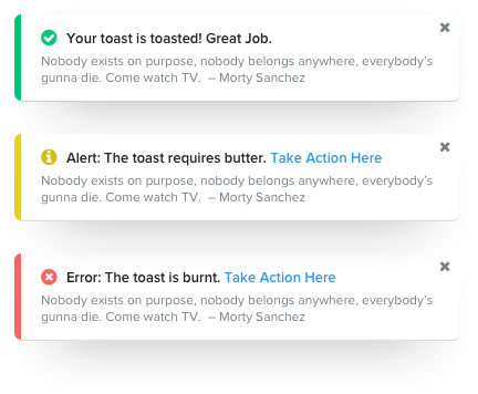
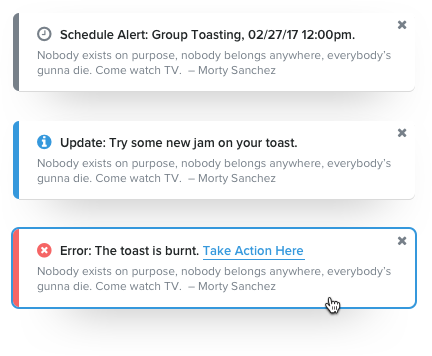
09User Feedback
Tooltips
Dictates the interaction of option selection from three or more options. Used when there is a list of options and the user may select any number of choices, including zero, one, or several. Use positive wording for checkbox label so it is 100% clear what happens when user checks the box. Use Label tags as click targets for all checkboxes.

Toasters
Used when there is a list of two or more options that are mutually exclusive. User must select exactly one choice. Clicking a non-selected radio button will deselect any previously selected radio buttons.
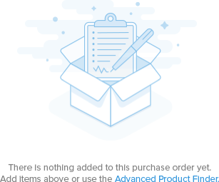
10Illustration
Empty States
Empty state illustration is used to explain a feature but should never be the primary focus of the page. It’s used to address the need to fill blank space or provide a bit of context while also taking advantage of an opportunity to inject some visual interest and personality into the app.
011Resources
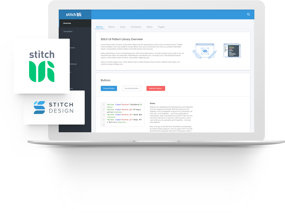
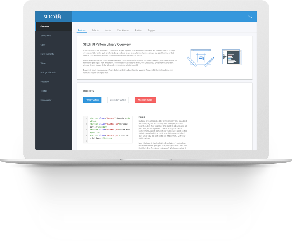
Stitch UI Dashboard
Once the design system is defined and thoroughly checked for edge cases and consistency, the Stitch UI dashboard was created to act as a resource for product and engineering. The dashboard documents all of the components and principles found in the system, allowing engineers to simply grab the code and use it where they need to. From here, it’s much easier to build off that core and adapt in the future, all while maintaining consistency.
This means we spend less time styling components and more time building. And when we sit down to build, it means spending less time trying to decide how to make things different for the sake of being different — and more time focused on building the product we envisioned.
Leveraging Sketch’s text styles, symbols and artboards allowed me to finetune a new component based workflow for the product design team. From there, you have a Sketch document template that has all these principles built into. Designers can rapidly wireframe/prototype with the styles of the current UI or jumpstart a new project.
 close
closeFlavr AppsUser Experience, Visual Design, Native Mobile, Android
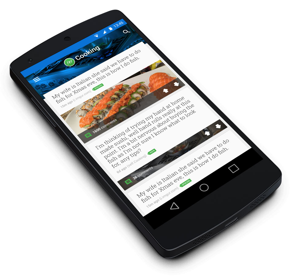
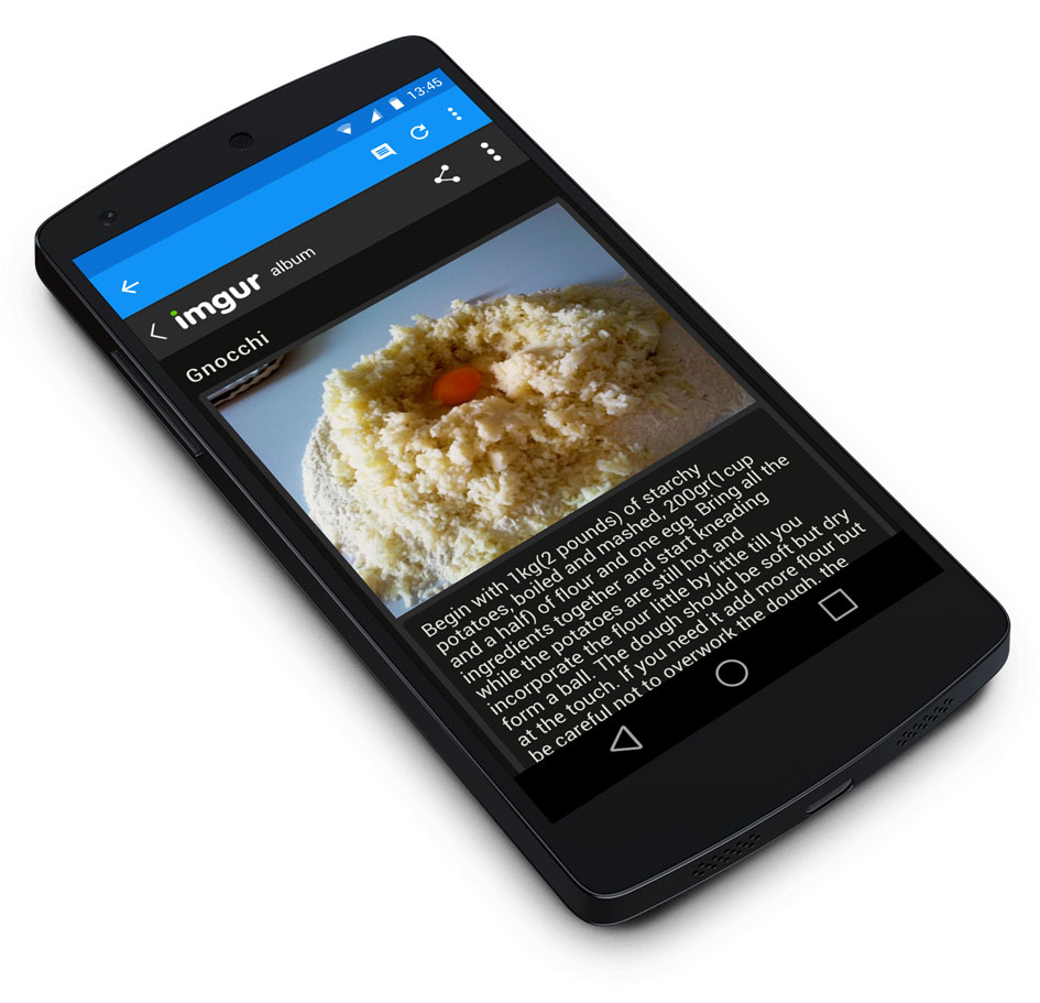
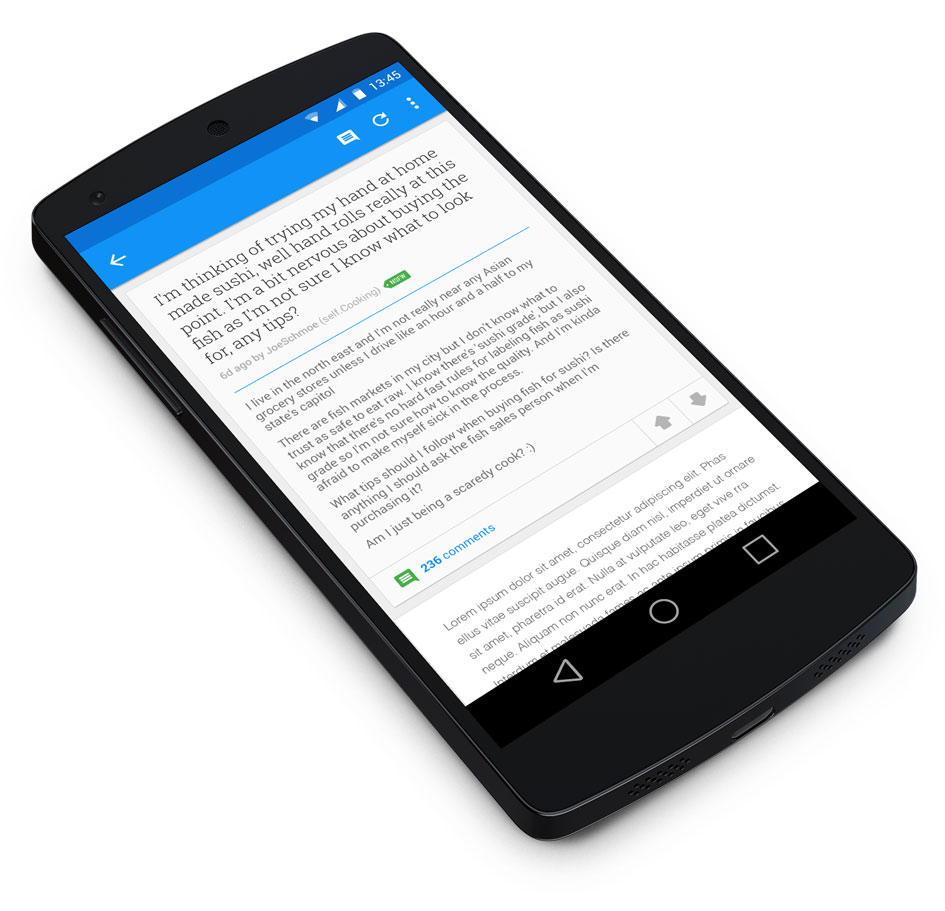
Essentially, The Flavr apps are just a family subreddit feeds. The initial concept was to develop a product that can be rapidly duplicated, rebranded, and applied across a variety of outlets. A clean, simplified interface for each app would be quickly skinned to correspond with the style of its specific subreddit and shipped out.
The Feed
Detail View - Link Post - Image
Detail View - Self Post - Text
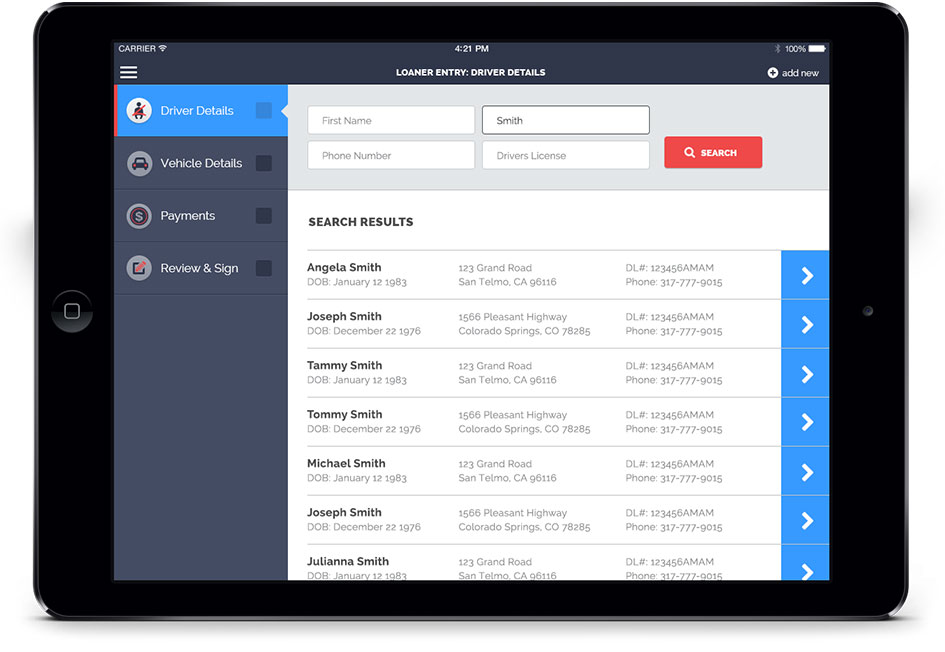
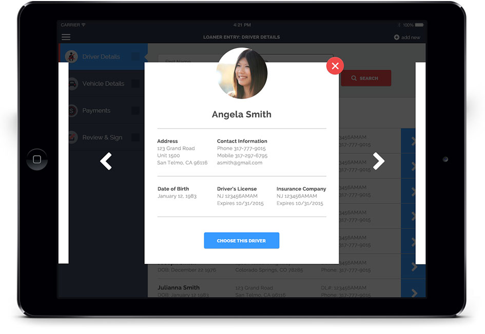
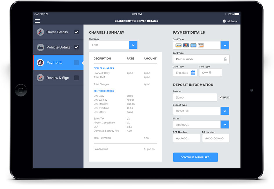
closeRentWorks AppUser Experience, Visual design, Native iOS, tablet
The RentWorks products live in a dark, dreary world similar aesthetically to that of the “dot net” realm of design. It’s difficult to use and even worse to look at. At Progress Software we redesigned their iPad app experience. I aided in the UX and task-flow designs and handled the visual designs too.
Springboard / Launchpad UI

Driver Search and Selection
Vehicle Search and Selection, Vehicle Details


Finalize, Payments, and Signature UI

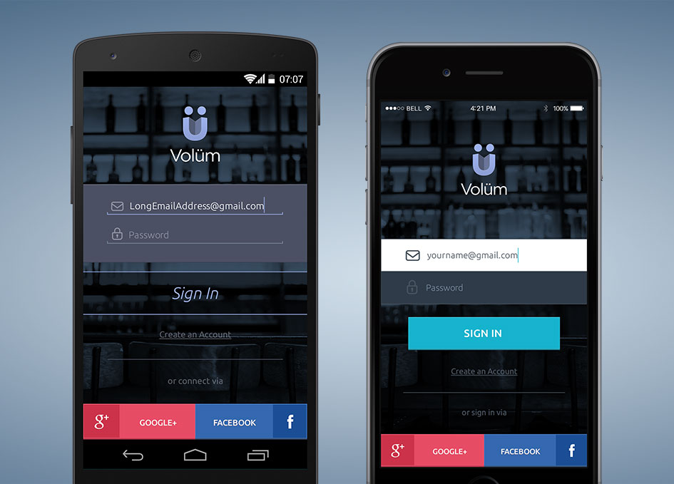
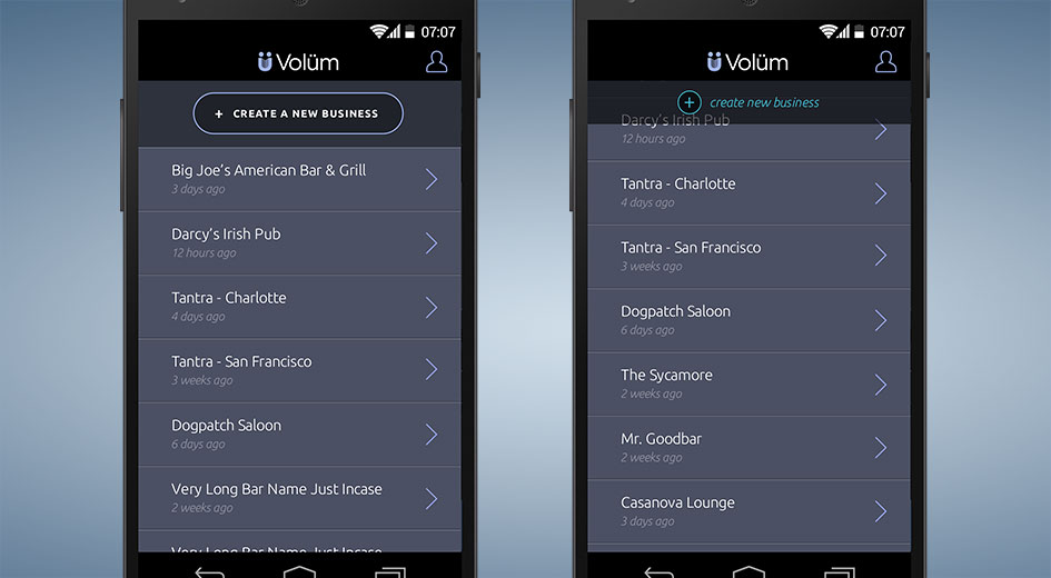
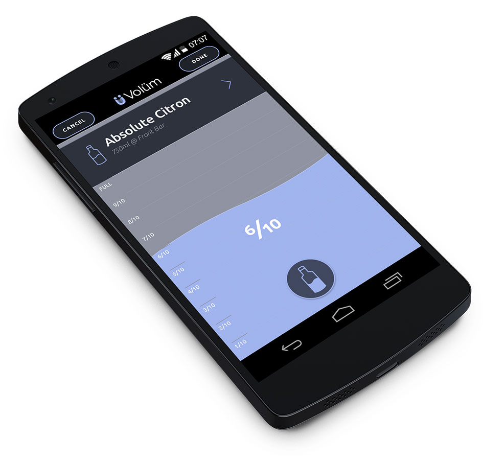
closeVolüm AppUser Experience, Visual Design, Native Mobile, iOS, Android
Volüm is a bar and restaurant owners greatest tool. It allows users to rapidly take and manage the inventory of alcohol at their bars — a common and tedious task that is required across the entire industry. I handled the visual design for both iOS and Android platforms.
Business/Bar Selection
Bottle Selection
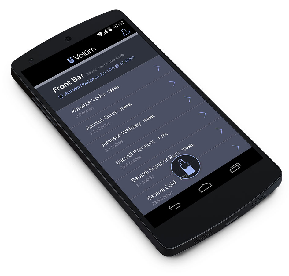
Grouped Inventory
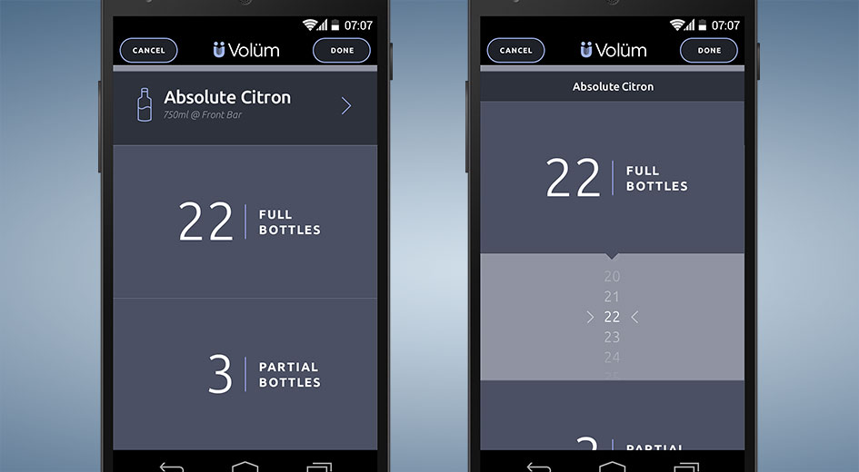
Individual Bottle Inventory

closeThis is the topEasylWeb-app, User Experience, Visual Design, Branding
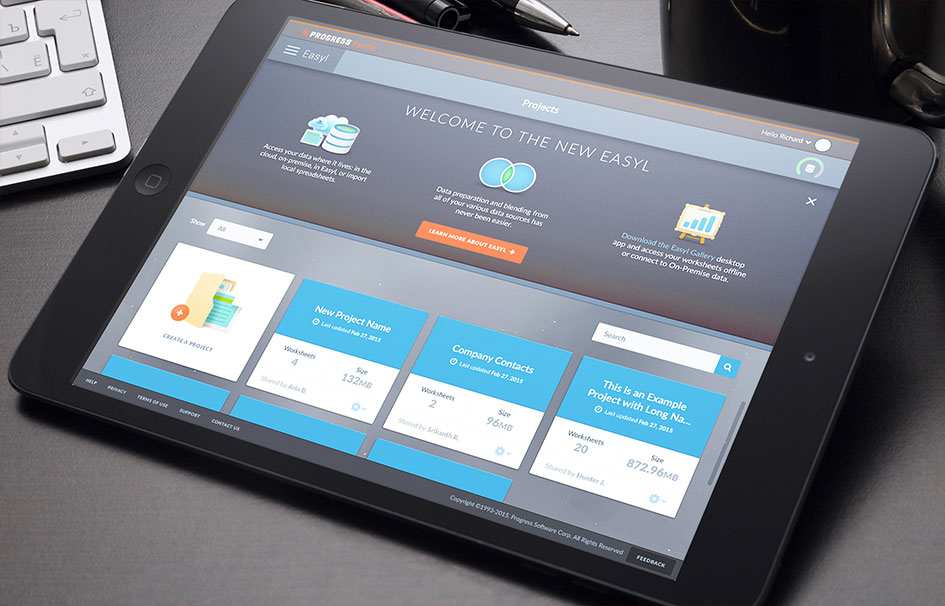
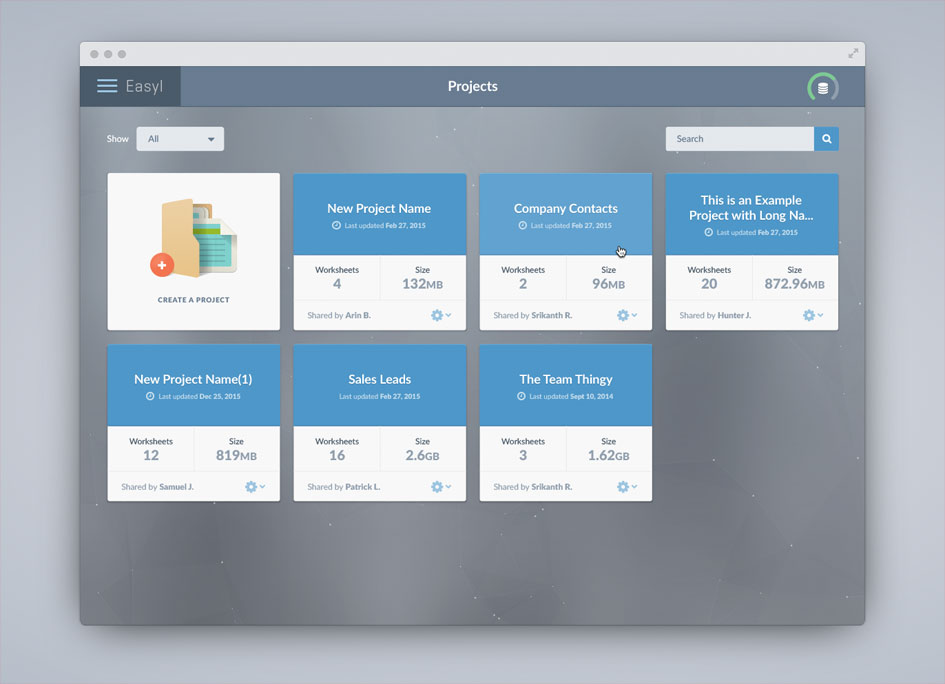
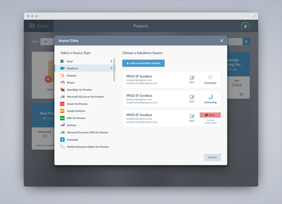
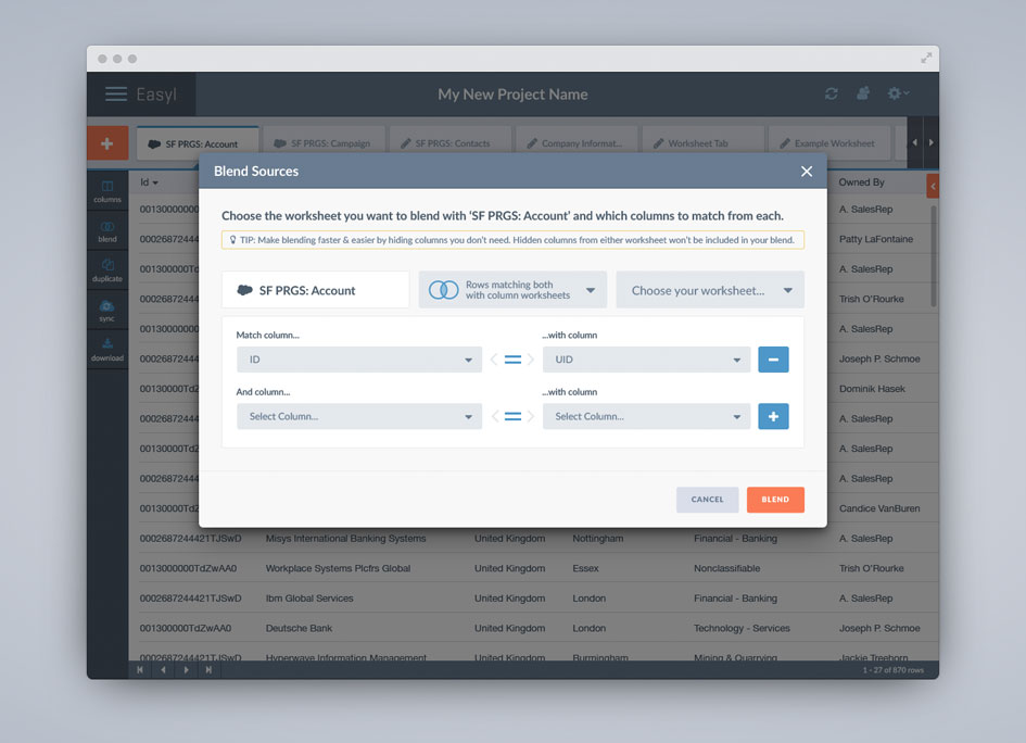
Easyl, a new data tool from Progress Software, allows end users to combine and analyze Cloud data from multiple sources (Eloqua, Hubspot, Google Analytics, Salesforce) and facilitates a collaborative working relationship for IT to work with them in building a well-managed data environment. I redesigned the entire product from the ground up by rethinking all workflows and developing a comprehensive visual language style guide targeting business users with ease of use in mind.
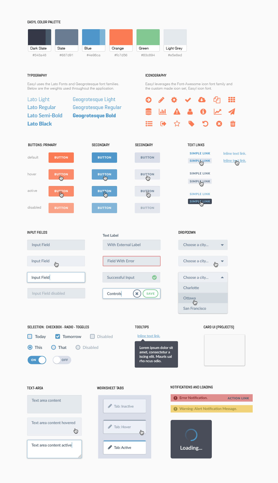
Easyl Visual Language - UI Style Guide and Toolkit
Wireframes and Workflows

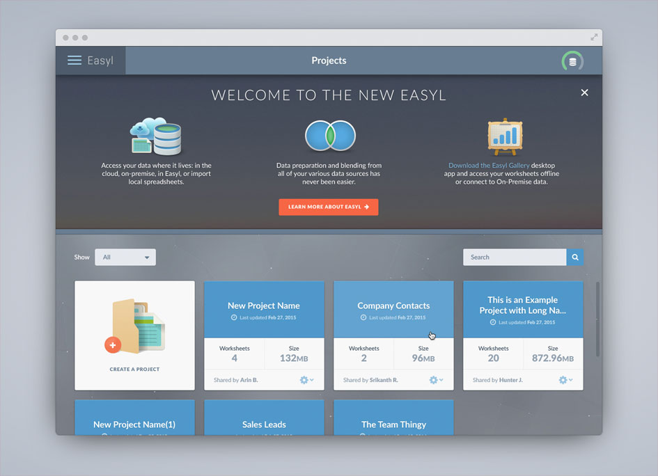
Projects Card UI
Importing Cloud Data Sources
Main Worksheet Space

Blending Worksheets and Data Sources
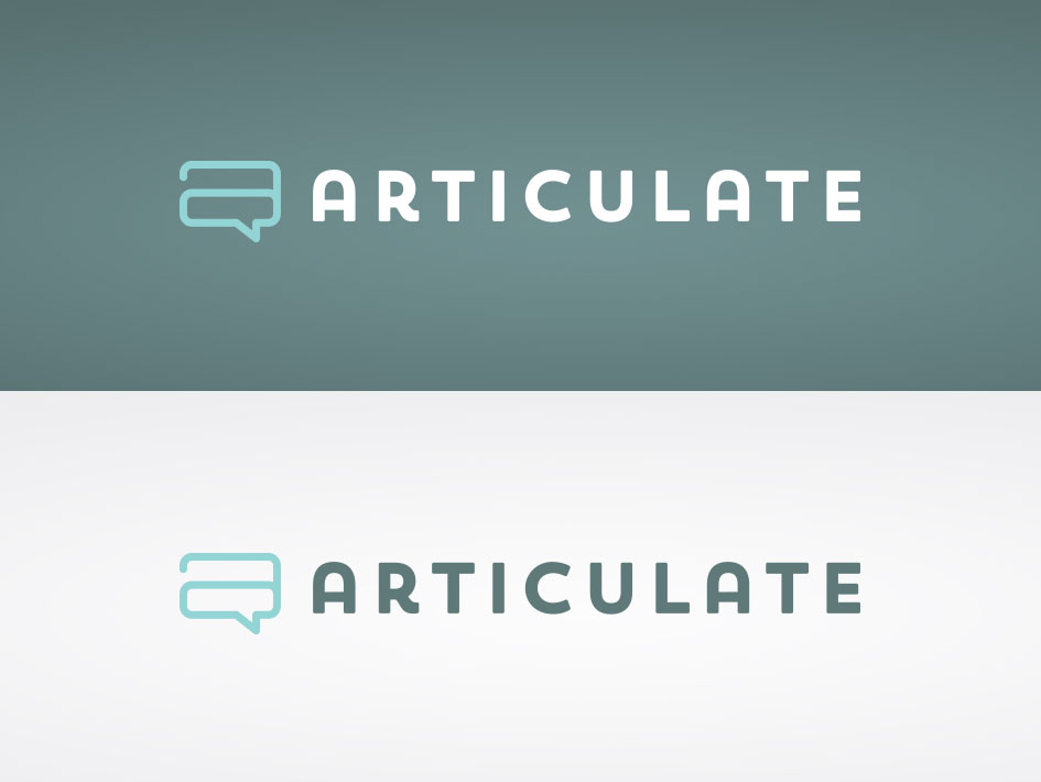
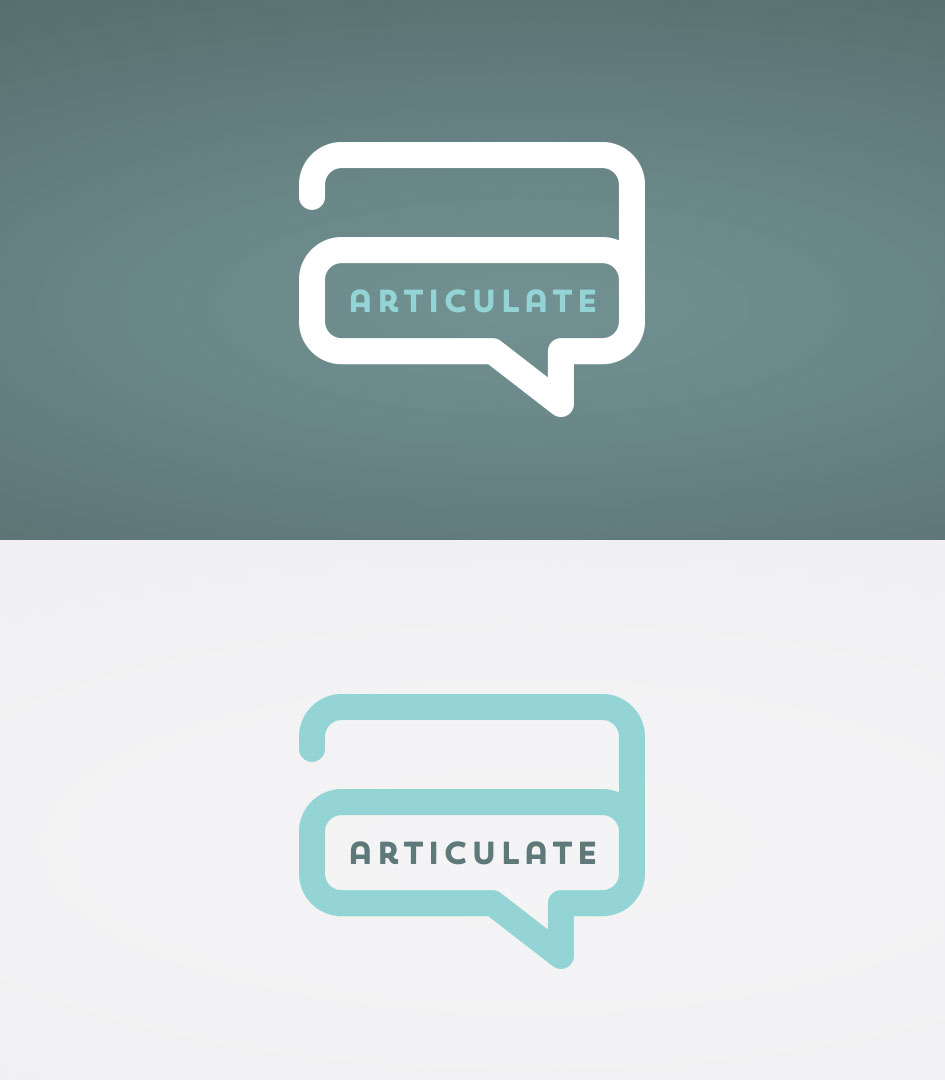
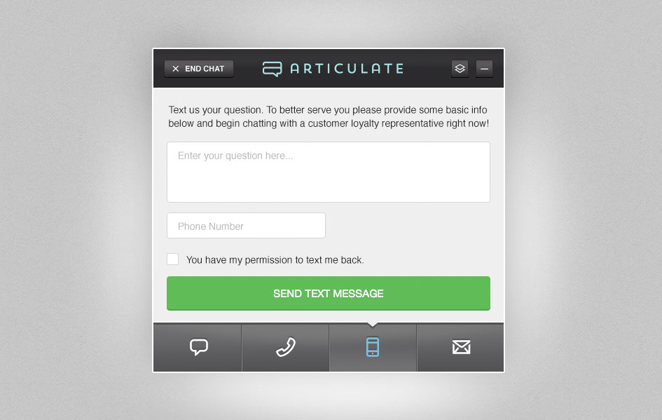
closeArticulateBranding, Visual Design
Also known as "live chat", Articulate is platform that allows users to communicate in real time using web interfaces. It enables customer service and support teams to connect with customers in real time while boosting CS agent efficiency and effectiveness. Part of my time at Red Ventures was centered around the development of company-facing, internal proprietary products and tools, such as Articulate. I contributed from a product design and branding perspective - focusing on company wide implementation and employee engagement.
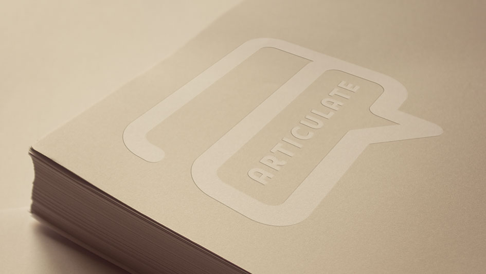
Logo Mark
Logo Mark Alternative
T-Shirt

Live Chat Application
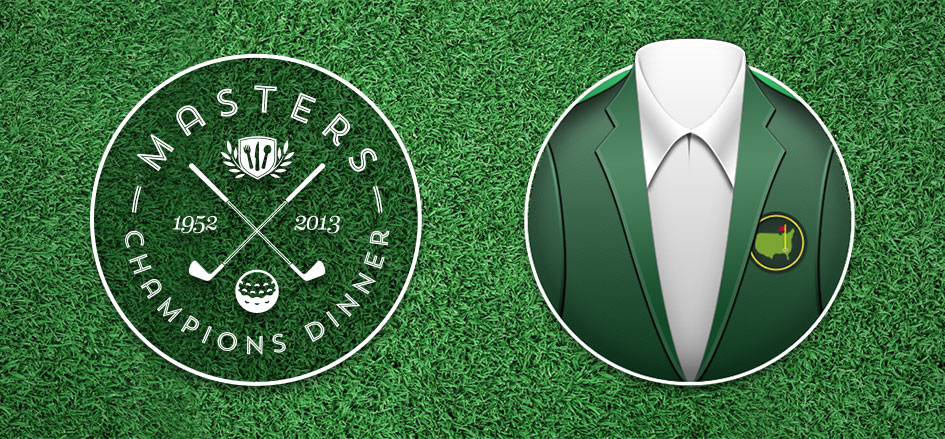
closeMasters InfographicVisual Design, IA, Icon Design, Illustration
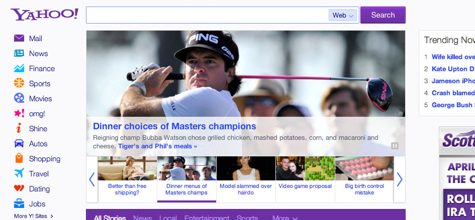
This infographic designed for DIRECTV was inspired by 20 years of menus from the Masters Champions Dinner. The champion from the previous year chooses and funds the current Champions Dinner which fueled the data and content for this infographic. It quickly garnered a lot of attention during the tournament and ultimately found it’s way on to the busy home page of Yahoo.

Front Page of Yahoo Status - Woot!
closeIconography & Logo MarksBranding, Illustration, Visual Design
Below you’ll find a few pieces taken from various branding and digital projects I’ve worked on recently.


closeHand Crafted LetteringHand-Lettering, Typography, Mural
Letterforms and type are some my favorite things in the world. Lettering serves as a opportunity for me to free myself from the digital restrictions of the computer (for part of the process) and exercise my hand and eye in other disciplines of design. It's a frequent reminder to simiply draw.
Experience Is Everything Mural
The design organization at Workday collectively elected the words "the experience is everything" and I turned it into a fun, collaborative large-scale mural in the office. I handled the hand lettering, video editing, and type animation with some help on the painting from 25+ coworkers

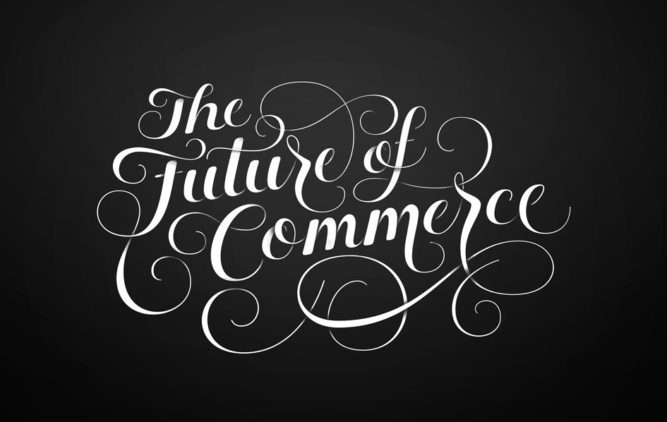
Future Of Commerce Office Mural
At Stitch, I was able to help with designing the interior of our new office in SOMA, San Francisco. This included designing a hand lettered, 30 foot indoor wall mural.
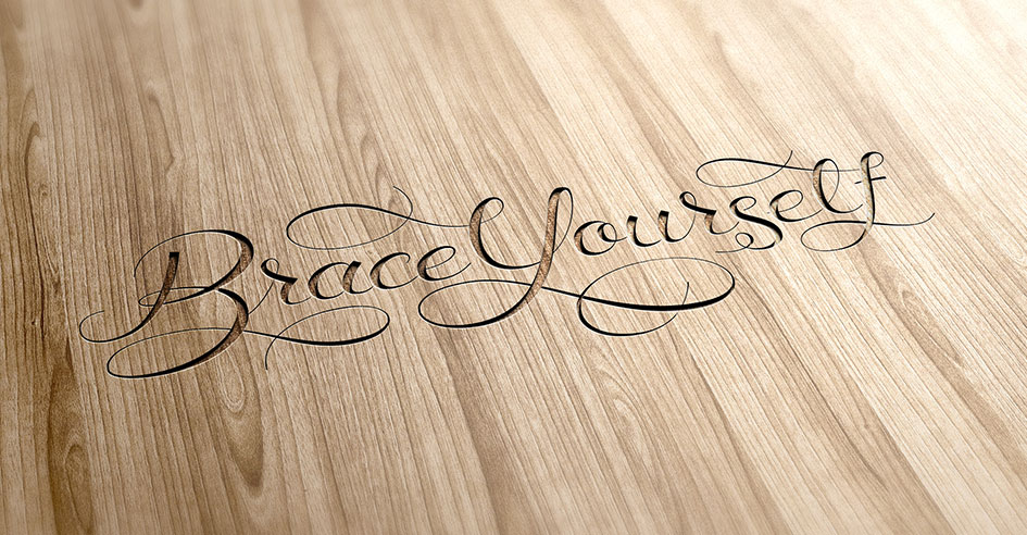
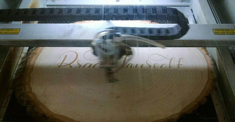
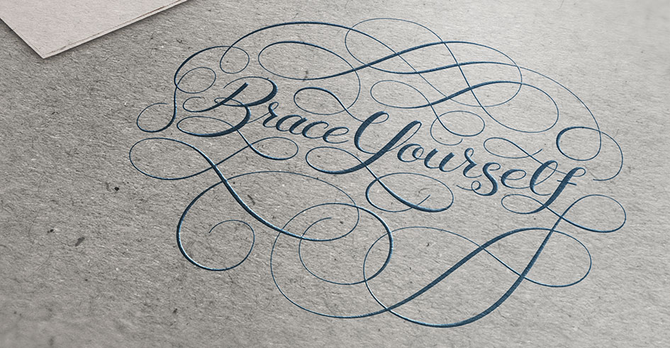
Brace Yourself Hand Lettering
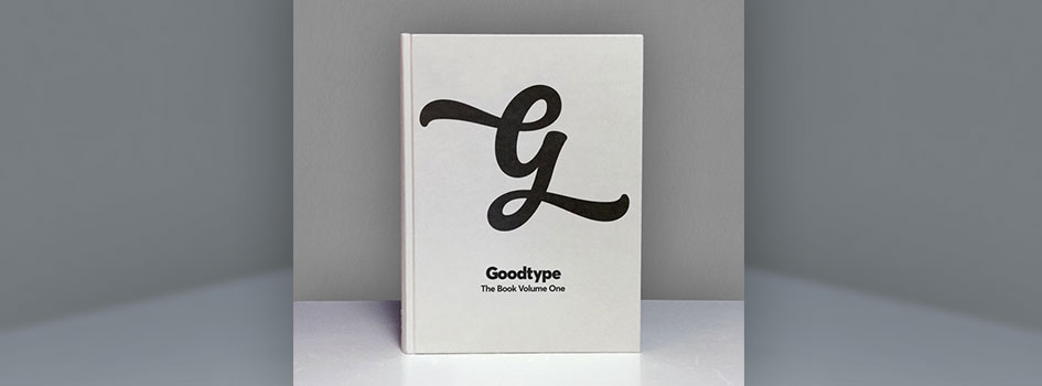
This lettering piece began as a fun personal project that I made to show support for a bandgoing to see. Ultimately it was selected to be published in the GoodType Book: Volume One, a 288 page curation of beautiful and eclectic letterforms from 175 artists and designers around the world.


GoodType Book: Volume One
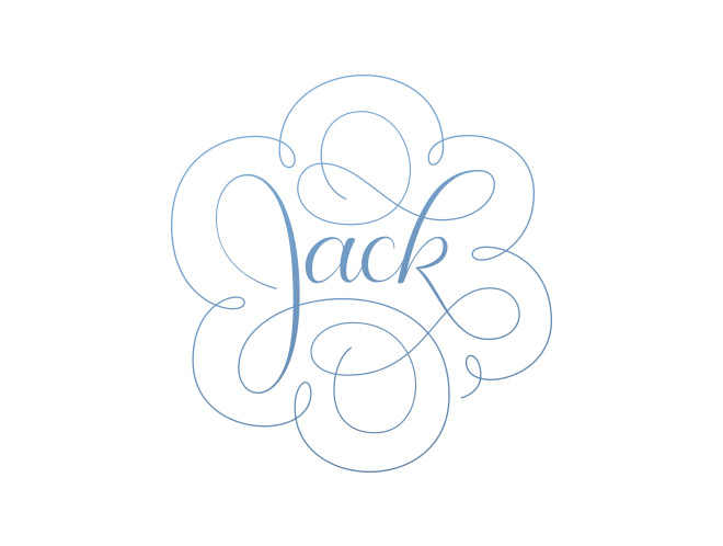
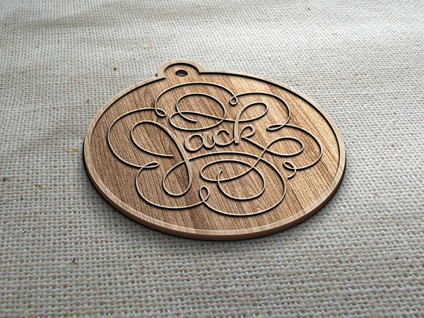
Jackboy Custom ID Tag
I have a dog named Jack. He's incredibly advanced with regards to obedience and tricks. I felt that he deserved an advanced dog ID tag. This work in progress will ultimately be laser engraved in both wood and metal. Final dog tag photos and process animation coming soon!


My Personal Thank You Stamp
The long standing simple thank you card has seemingly gone to the wayside. I think this makes them even more special for the recipient. I use this stamp to help me rapidly crank them out.

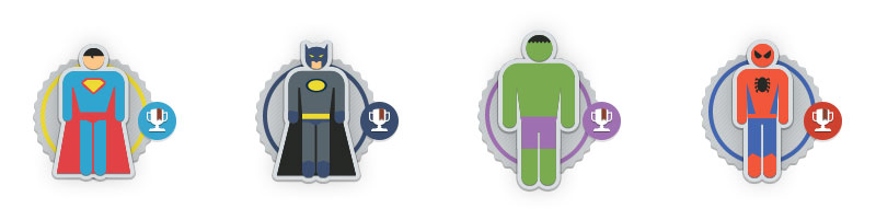
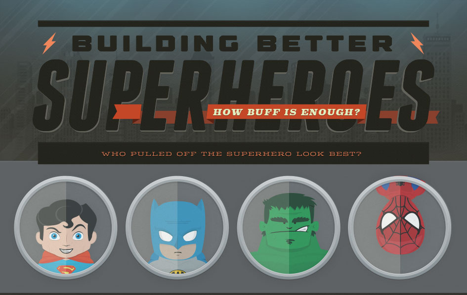
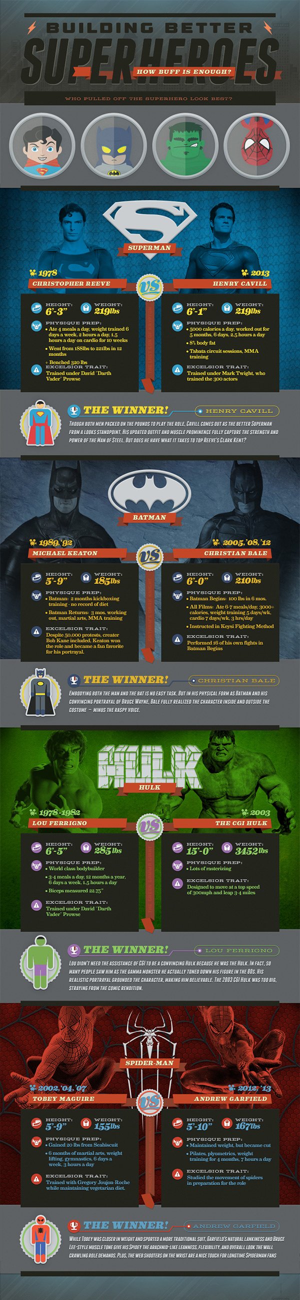
closeSuperheroes InfographicVisual Design, IA, Icon Design, Illustration
Throughout film’s history, superheroes have been a popular subject but have been conveyed in a variety of ways. The Building Better Superheroes infographic is all about comparing and analyzing how filmmakers and screen writers have chosen to portray the characters of Superman, Batman, The Hulk, and Spiderman.
Let's connect.
Have your people get in touch with my people. I’m a designer who likes to talk about the way we work and I’m always on the hunt for fresh, exciting work opportunities. Shoot me a quick note below and I'll be in touch as soon as possible.More ways to connect: